
21 Sep Case Study: Verizon Rebrand
It’s only fitting that I write about Verizon’s new logo that was unveiled on the heels of Google’s new logo. Merely one day after Google presented its simplified identity, Verizon did the same.
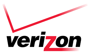
Verizon, the nation’s largest wireless carrier, has used the same logo for fifteen years. In 2000, with the merger of Bell Atlantic and GTE Corp, Landor Associates developed the existing logo.
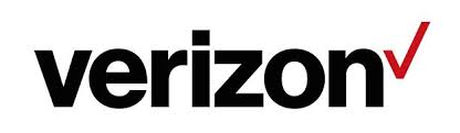
The new logo retains the original colors as well as the iconic check mark. Verizon’s redesign is cleaner by removing transparency and fading. It’s simpler without the large check spanning the entire logo name. What remains is a flat, black, sans serif typeface with a simple red check.
The carrier says the design is “more than just a new look” and that it “marks the beginning of the next chapter to distinguish Verizon in the minds of consumers and signals our revitalized purpose of delivering the promise of the digital world—simply, reliably and in a way that consumers want.”
The purpose of the logo is to invoke “simplicity, honesty and joy in a category rife with confusion, disclaimers and frustration,” according to Verizon’s blog upon release. “It’s a cleaner, more human design and the check mark, the universal symbol for getting things done, uniquely expresses the reliability of Verizon.”
Why is everyone simplifying and cleaning up their logos?
It appears that theses large communication giants know the direction technology is moving. With the small sizing and variety of mobile devices, brand recognition needs to “clean up” to remain readable and recognizable.
Did they do a good job?
I would love to hear your thoughts. Personally, I do think it was time for a redesign, but I think there is an element of boredom to this. I love clean lines and simplicity; however, there is something about the placement and size of the checkmark that seems to miss the mark for me. While I like the Helvetic font, I’m not sure it’s accomplishing what Verizon set out for….approachable and consumer-friendly.
Who will be the next to change their look?
Perhaps you’re feeling like it is time to freshen things up. Call or email today to schedule a free consultation. It’s my pleasure to create brands that are accurate, relevant and represent your business well!