03 Sep Case Study: Google Rebrand
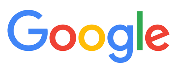
Google, a brand we are all familiar with, has changed its look after 16 years. Since 1999, Google has grown to be one of the most known and recognizable brands. However, it’s relied on an old looking, disproportionate, serif font which most designers would wrinkle their noses at.
Why?
Not surprisingly, Google has evolved over the years. It has become far more than just a search engine or web browser. Hence, the task of the logo has changed. Primarily, the size and scalability have become problematic. The logo has many tasks beyond business cards and letterhead, it has to span all technology platforms from smartphones to TVs, from tablets to watches. It becomes imperative that the logo can adapt to each use well and maintain consistency without compromising recognition.
Designed in-house, Google created three main elements: an updated san serif logo, interactive dots, and Google “G” which is a compact standalone version of the logo.
The remarkable thing is that each of these elements, though new, instantly are Google recognizable. By maintaining the original colors, even the dots say Google. I, personally, love the way they work in conjunction with one another. Even the tilted “e” remains.
As I mentioned earlier, the original logo appeared noticeably disproportionate. This updated version uses good mathematical spacing and balance—making everything seem more conjoined.
There is nothing surprising about the new logo—nothing alarmingly “new.” Google simply played upon what it had to enhance it purposes and create modern appeal. Well done, Google!
For more information visit twitter.


